Completed my first mobile app and its accompanying case study via Coursera. Transitioning to UX design proved to be quite a demanding journey, but the rewards have certainly justified the effort.
About the Project
The suggested portfolio project prompt is a trailer browsing app for a movie theater. A local movie theater, despite being a small company, they want to be able to compete with major theaters and set them apart from their rivals. Users can connect and engage with others via the app and enable on-the-go ticket purchases.
PROJECT DURATION: June 2023–August 2023
Project Overview
THE PROBLEM: A local theater does not have an app.
THE GOAL: Design an app to help users find new movies, watch movie trailers, read reviews, and purchase tickets all in one place.
THE ROLE: I am the only UX designer in this project and designed it from conception to delivery of the project.
THE RESPONSIBILITIES: Conducting interviews, competitor audit and report, paper and digital wireframing, low and high-fidelity prototyping, conducting usability studies, accounting for accessibility, and iterating on designs.
User Research Summary
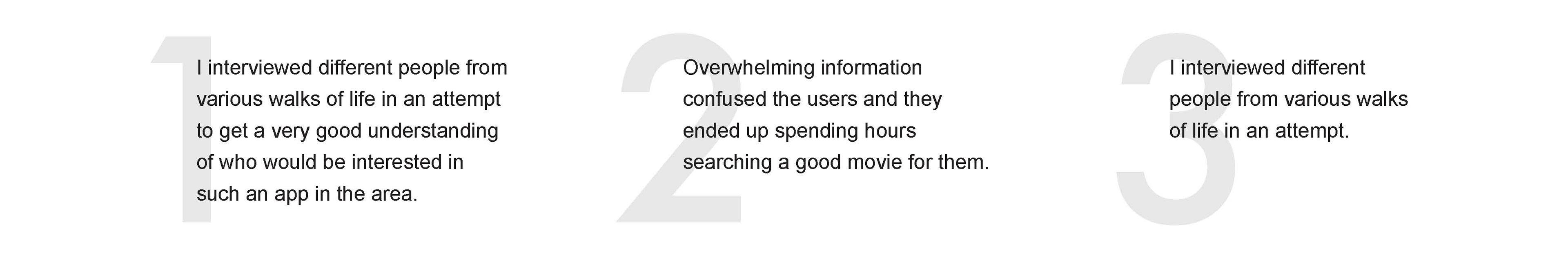
The initial action was to go deep into research and conducted interviews with a variety of people (aging between 18–65) from diverse backgrounds in an effort to gain a thorough knowledge of the local population's potential interest in such an app.
To further understand the possible users and competitors, I conducted surveys and online polls of additional potential users, conducted a competitive audit report, and generated user personas, problem statements, and user journey maps.
Pain Points:
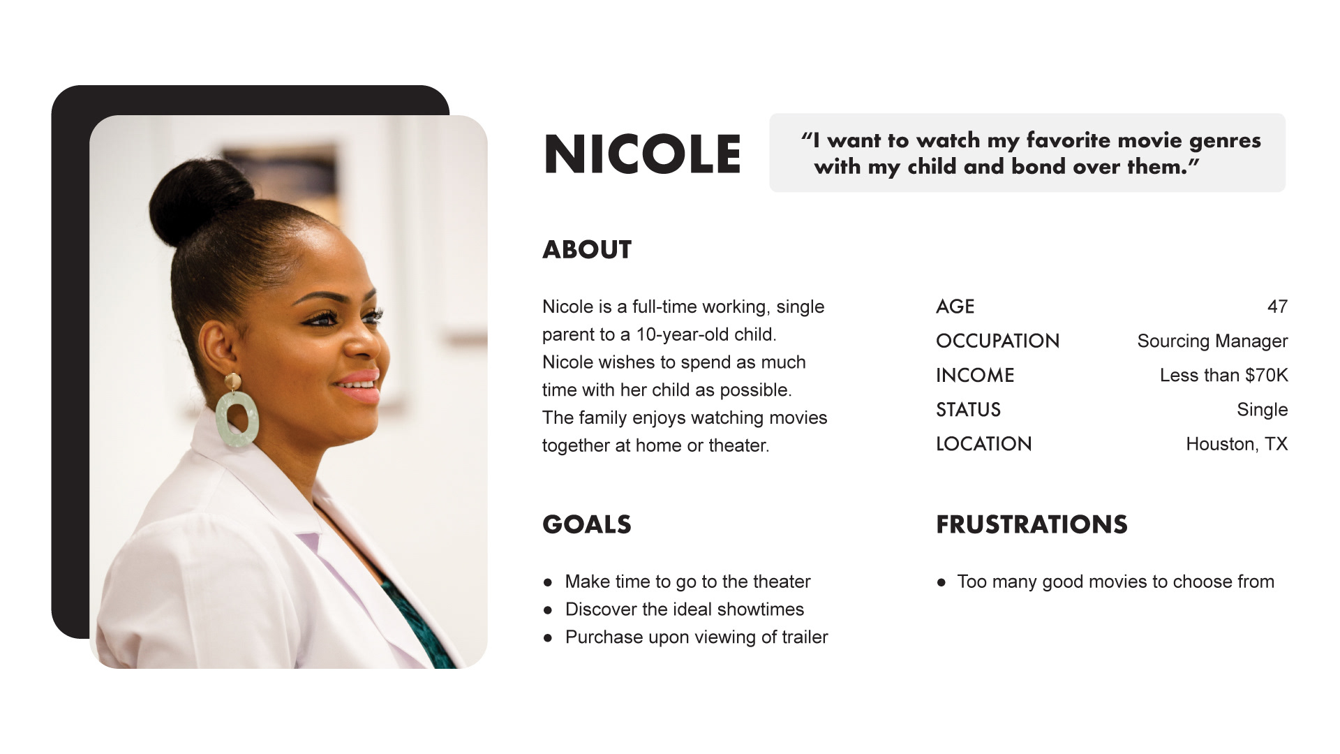
User Persona
PROBLEM STATEMENT: Nicole is a busy single parent who in need a means to view movie trailers and read reviews before selecting a movie because there are too many to choose from.
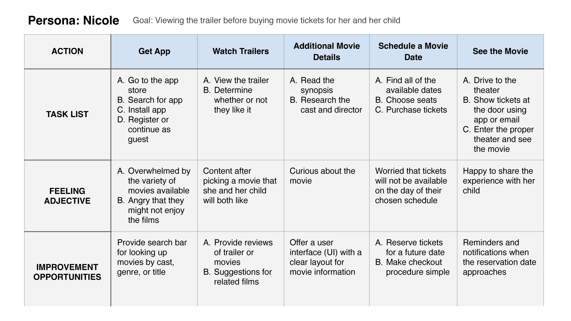
User Journey Map
Mapping Nicole's user journey revealed how helpful it would be for users to have access to a movie trailer browsing app.
Paper Wireframes
I started the design process by having the idea that the navigation of the app should be quick and easy.
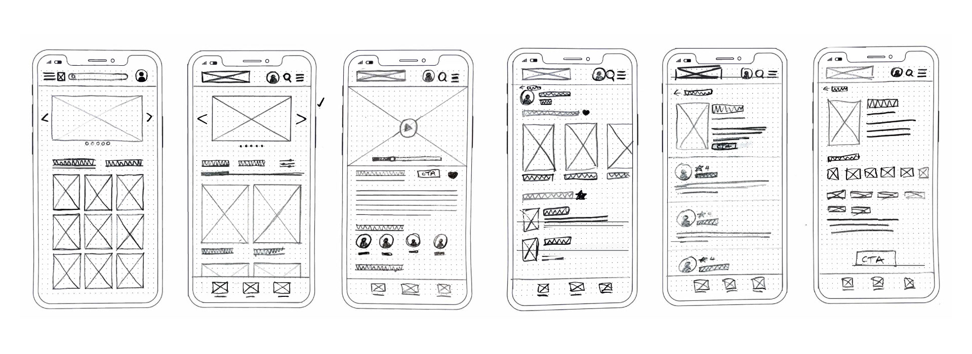
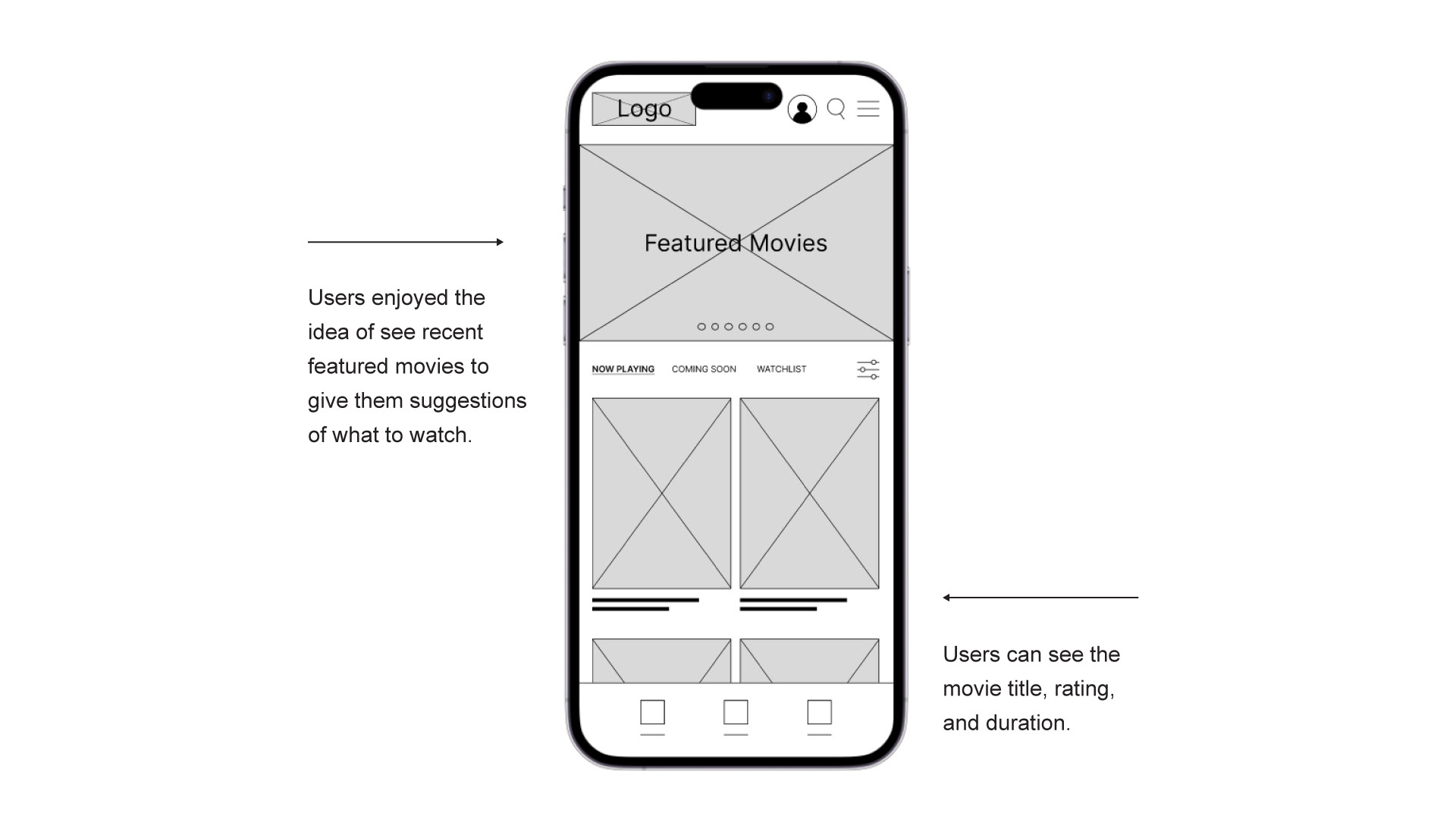
Digital Wireframes
As the initial design phase continued, I made sure to base screen designs on feedback and findings from the user research.
Low-fidelity Prototype
Using the completed set of digital wireframes, I created a low-fidelity prototype. The primary user flow I connected was ticket purchasing, so the prototype could be used in a usability study.
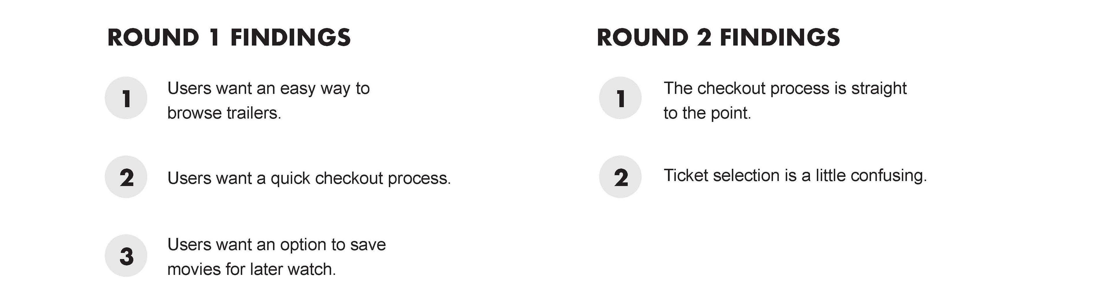
Usability Study
I conducted two rounds of usability studies. Findings from the first study helped guide the designs from wireframes to mockups. The second study used a high-fidelity prototype and revealed what aspects of the mockups needed refining.
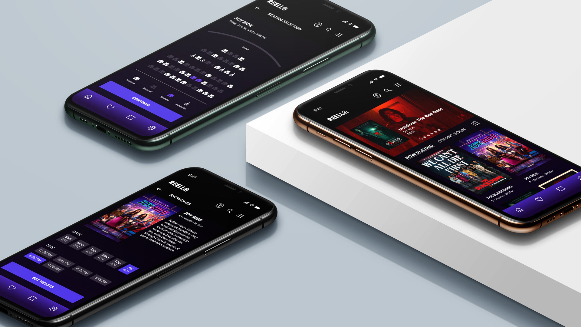
Mockups
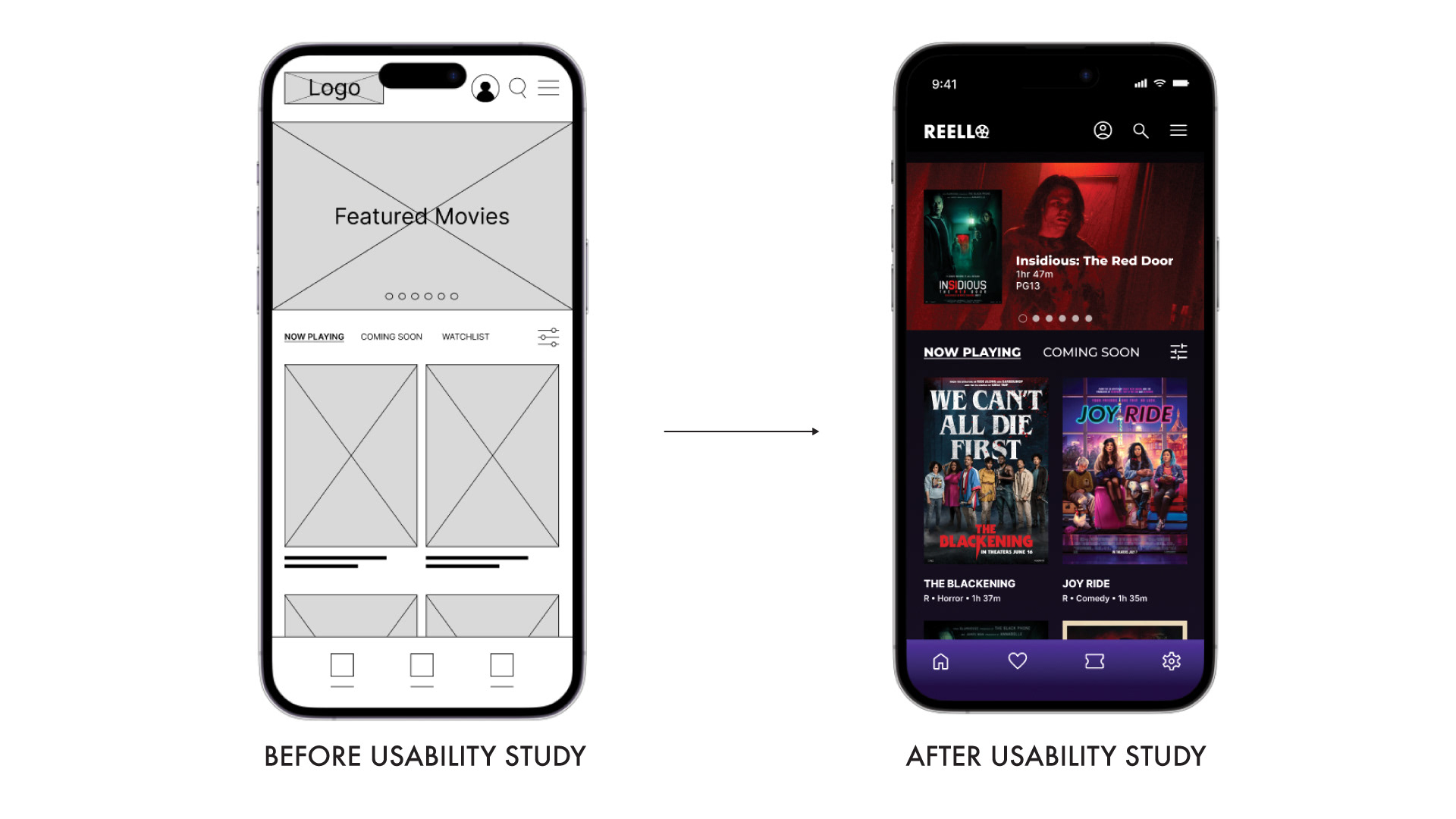
Early designs allowed for some customization, but after the usability studies, took out the link to "Watch List" and add it as an icon to the footer to give more room at the top section.
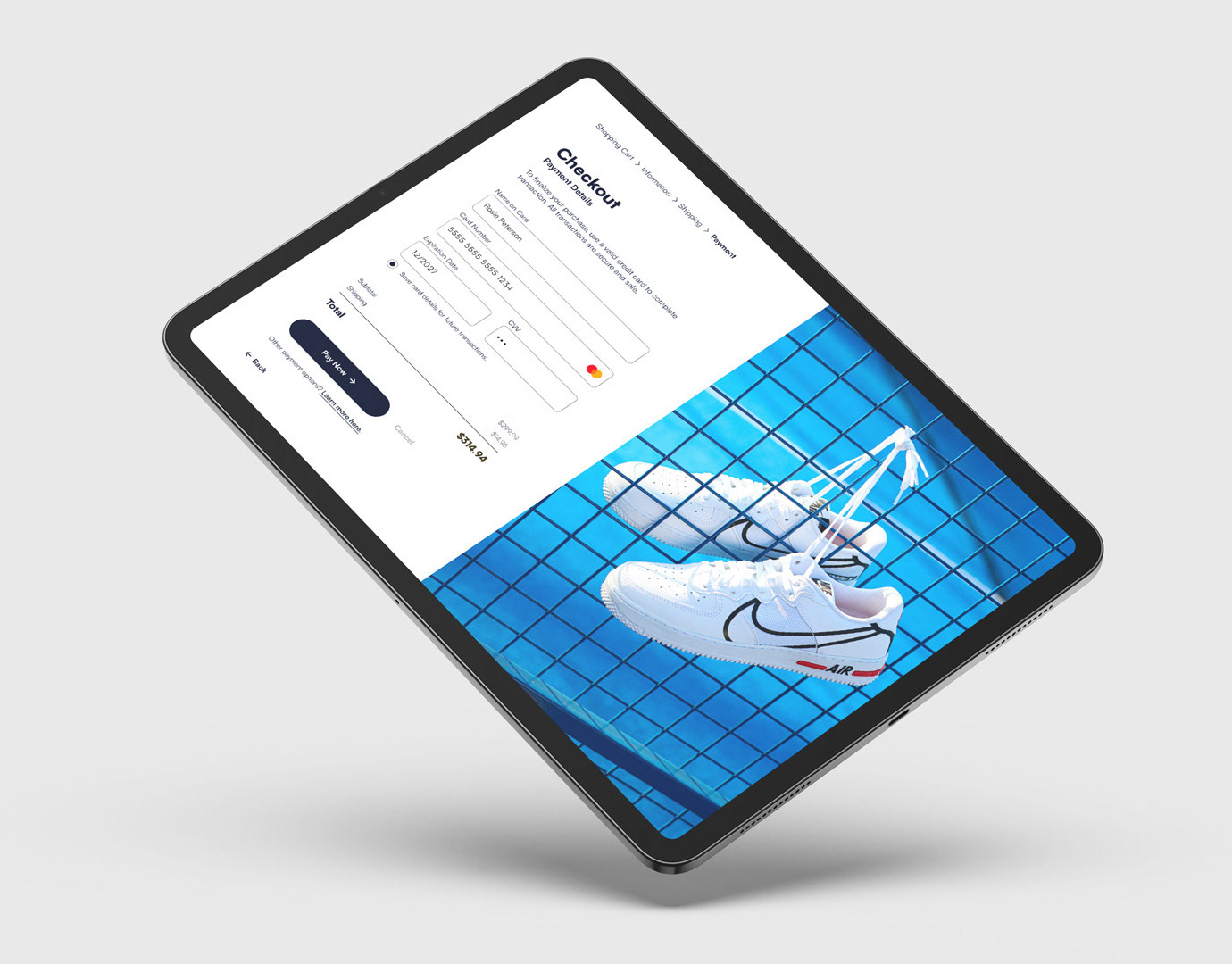
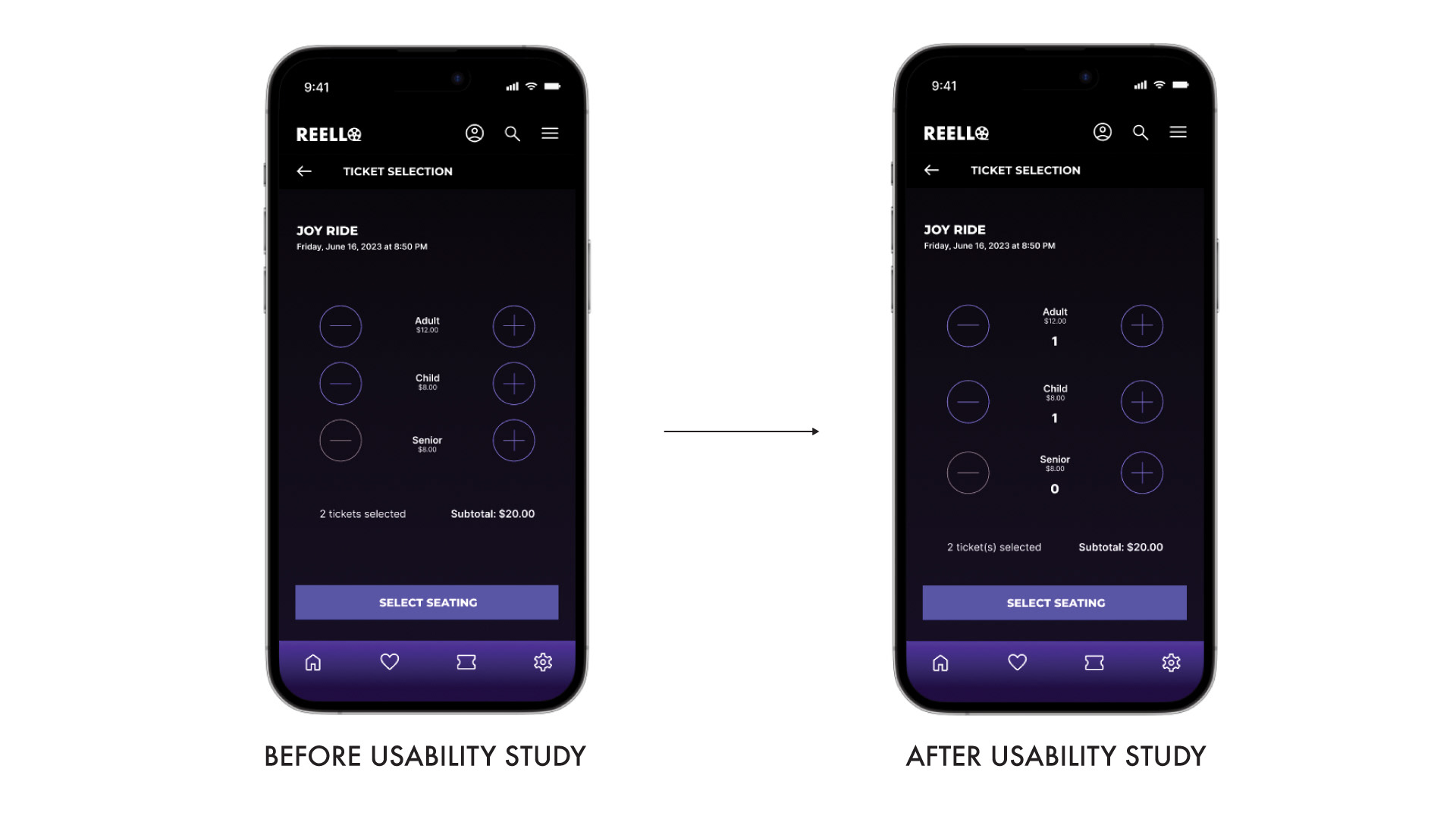
Users were unable to specify how many tickets in which category they had chosen, according to the second usability research. To denote the number of a ticket, I included a number indicator.
High-fidelity Prototype
The final high-fidelity prototype presented cleaner user flows for browsing trailer and checkout. It also met user needs for a easy process.
Takeaways
IMPACT: Users of the app are given the impression that it has given careful consideration to how to suit their needs and demands.
One quote from peer feedback: "This feature is useful because I am able to confirm what movie I want to watch, and go through the checkout process quickly.
WHAT I LEARNED: I learned that the process continued with the first app concepts while creating the trailer browsing app. Each version of the app's designs was impacted by user experience research and peer reviews.