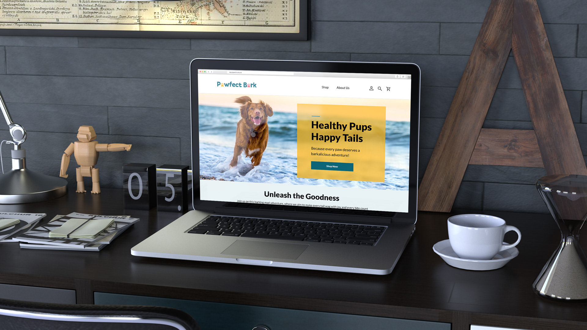
Pawfect Bark is a concept brand redefining what it means to feed man’s best friend the right way. The company creates all-natural, organic dog food crafted with love, care, and a sense of fun because healthy eating should make tails wag.
More than just a fictional dog food company, Pawfect Bark is a pack of dog-loving visionaries who have traded lab coats for leashes and petri dishes for paw prints. Every product is thoughtfully made to nourish dogs naturally, from wholesome meals that fuel daily adventures to organic treats that make every moment more joyful.
Healthy. Happy. Pawfect.
Industry: Pet Food
Services: Logo, Branding, Visual Identity, Packaging, Website
Softwares: Figma, Illustrator, Photoshop
Overview
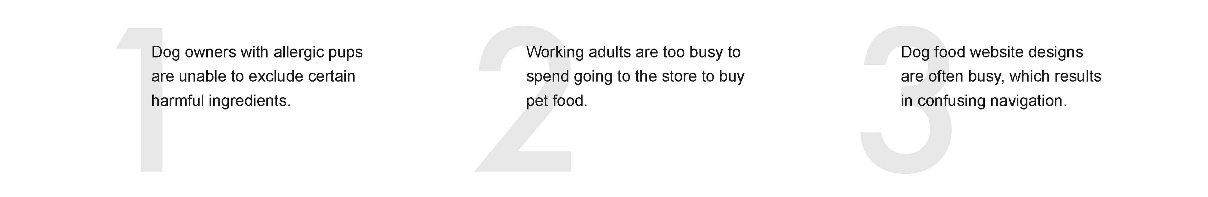
THE PROBLEM: E-Commerce or online storefronts feature crowded designs and confusing checkout processes.
THE PROBLEM: E-Commerce or online storefronts feature crowded designs and confusing checkout processes.
THE GOAL: To provide an online experience that would meet consumers' expectations for more convenience and confidence when buying dog food, allowing them to access information and place orders in one location.
THE ROLE: UX designer lead in the website of an organic dog food brand.
THE RESPONSIBILITIES: Conducting interviews, competitor audit and report, paper and digital wireframing, low and high-fidelity prototyping, conducting usability studies, accounting for accessibility, and iterating on designs and responsive design.
User Research Summary
The first step was to do extensive research and interview a wide range of dog owners (ranging in age from 18 to 65) from various backgrounds in an effort to fully grasp their requirements.
The first step was to do extensive research and interview a wide range of dog owners (ranging in age from 18 to 65) from various backgrounds in an effort to fully grasp their requirements.
Many dog food websites are difficult to browse and can be overwhelming, which irritates many of the target audience. Due to this, a delightful experience for them turned into a struggle, negating the aim of being simple to acquire.
Pain Points:
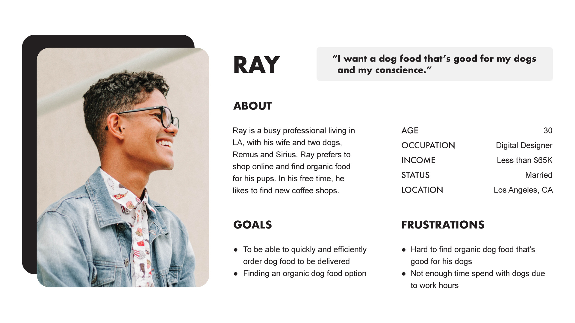
User Persona
PROBLEM STATEMENT: Ray is a busy dog owner who needs a website that can successfully and easily deliver dog food because he needs bulk food for his dogs.
PROBLEM STATEMENT: Ray is a busy dog owner who needs a website that can successfully and easily deliver dog food because he needs bulk food for his dogs.
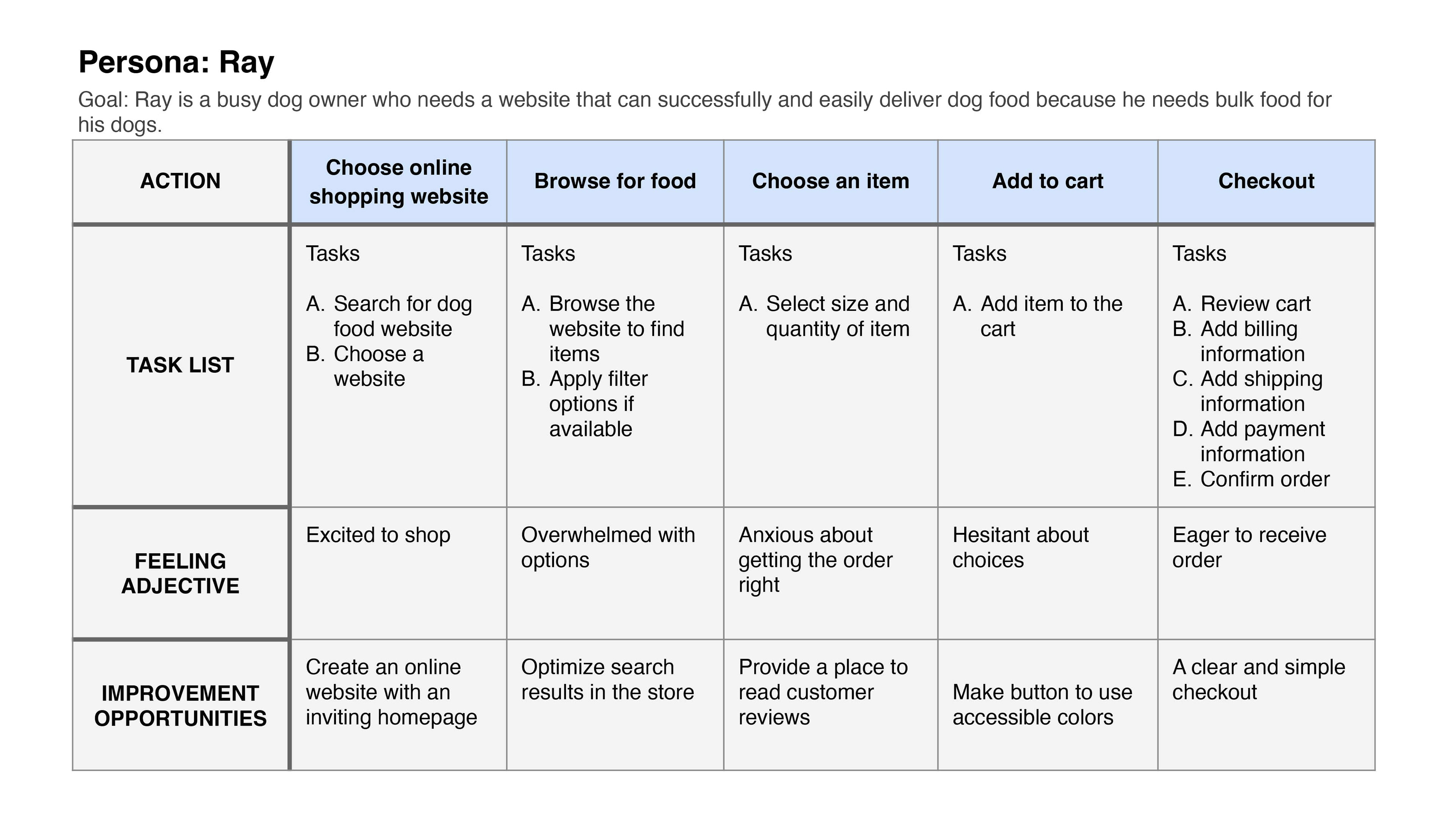
User Journey Map
Mapping Ray’s user journey revealed how helpful it would be for users to have access to an organic dog food brand website.
Mapping Ray’s user journey revealed how helpful it would be for users to have access to an organic dog food brand website.
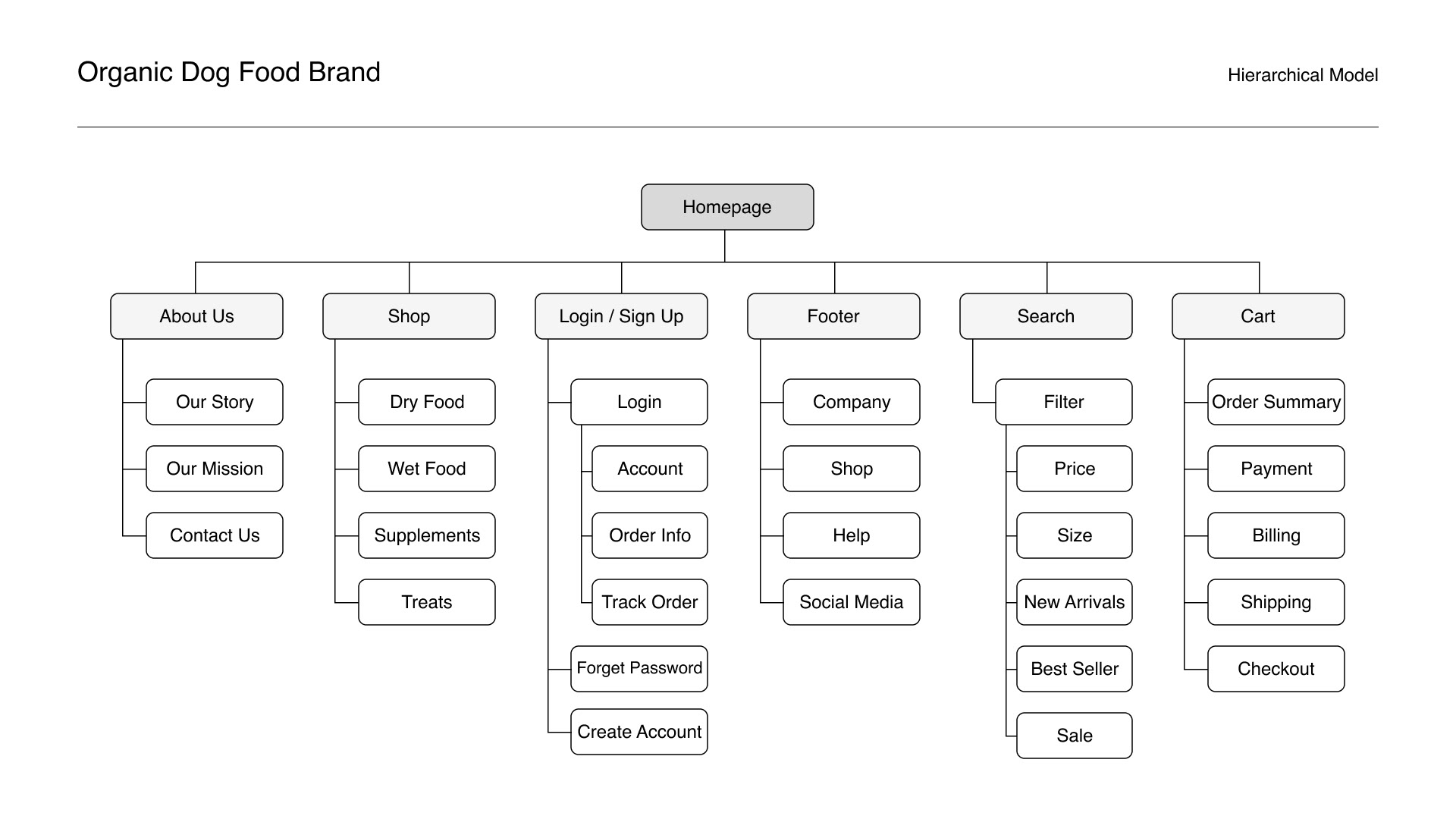
Sitemap
Difficulty with website navigation was a primary pain point for users, so I used that knowledge to create a sitemap. My goal here was to make strategic information architecture decisions that would improve overall website navigation. The structure I chose was designed to make things simple and easy.
Difficulty with website navigation was a primary pain point for users, so I used that knowledge to create a sitemap. My goal here was to make strategic information architecture decisions that would improve overall website navigation. The structure I chose was designed to make things simple and easy.
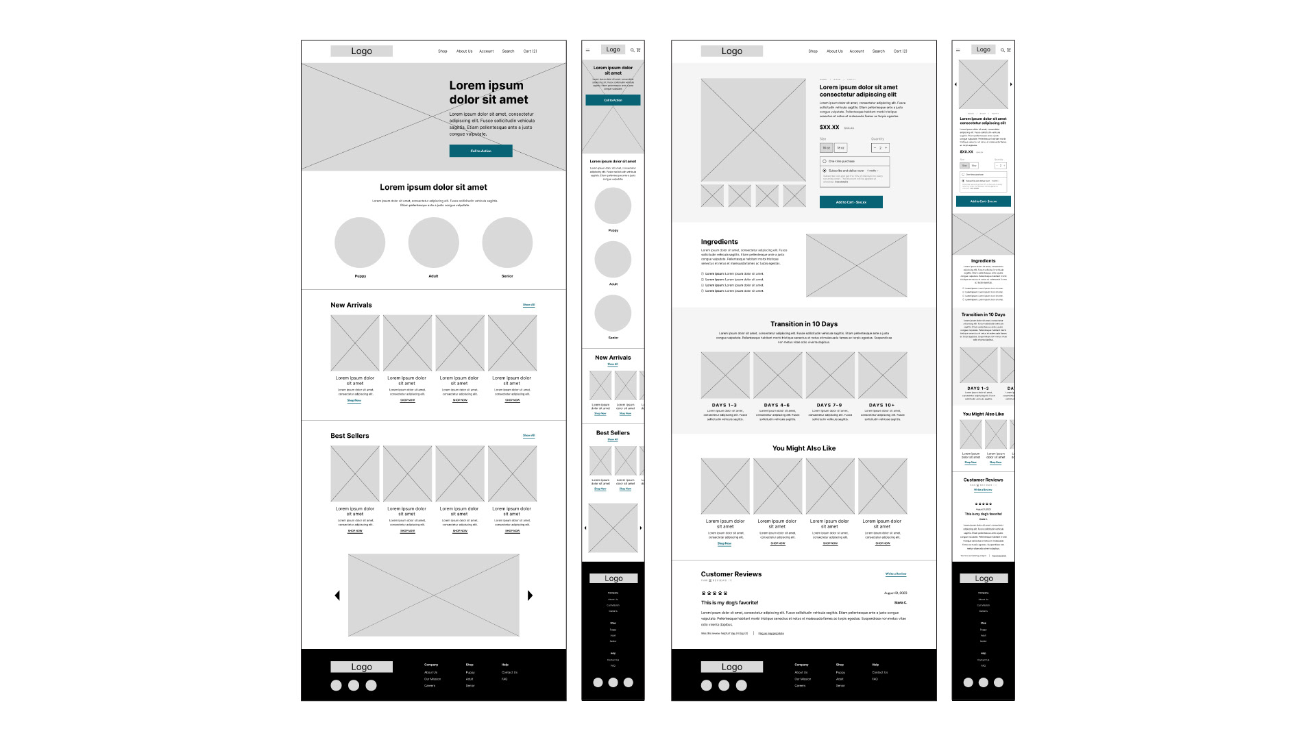
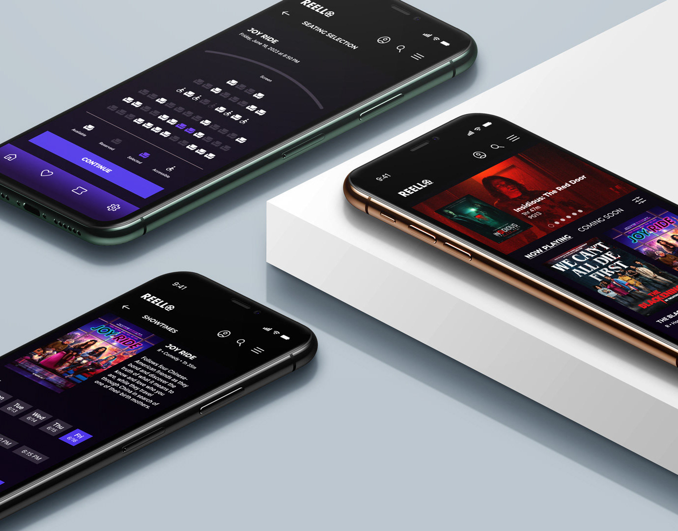
Digital Wireframe (Screen Size Variations)
As the initial design phase continued, I made sure to base screen designs on feedback and findings from the user research.
As the initial design phase continued, I made sure to base screen designs on feedback and findings from the user research.
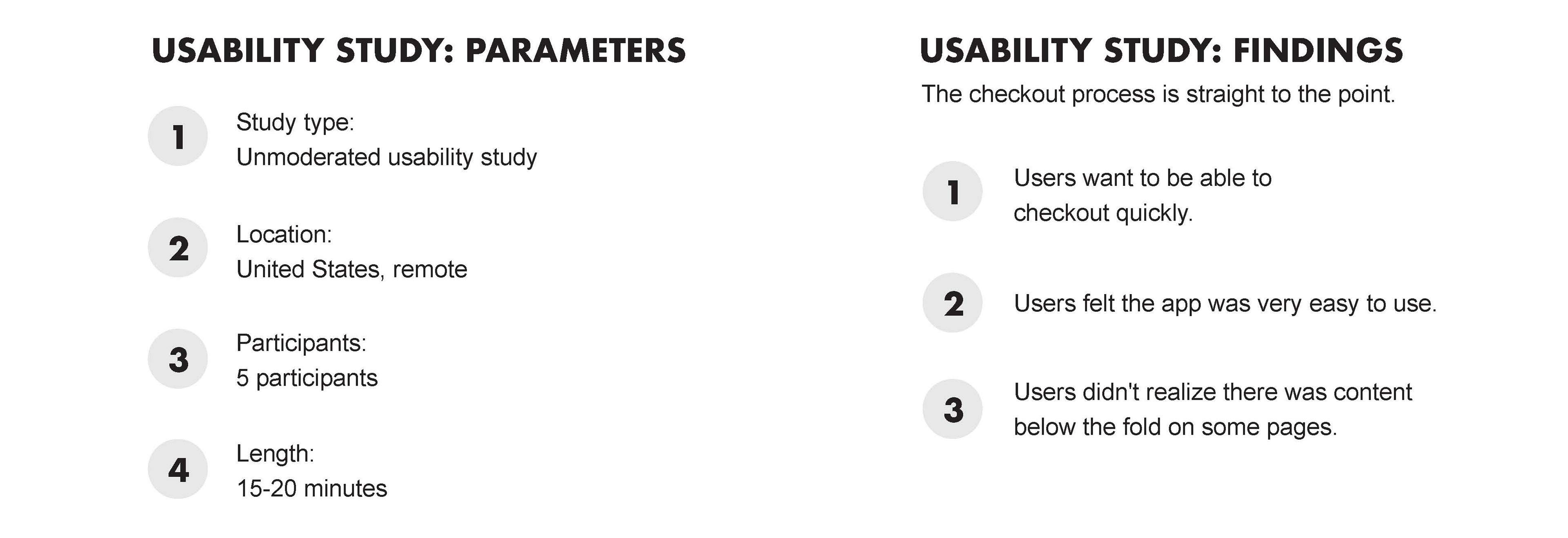
Usability Study
Mockups (Screen Size Variations)
Early designs allowed for some customization, but after the usability studies, I added additional elements to the product detail page (PDP). I also made revisions to include icons so users can navigate more easily.
Early designs allowed for some customization, but after the usability studies, I added additional elements to the product detail page (PDP). I also made revisions to include icons so users can navigate more easily.
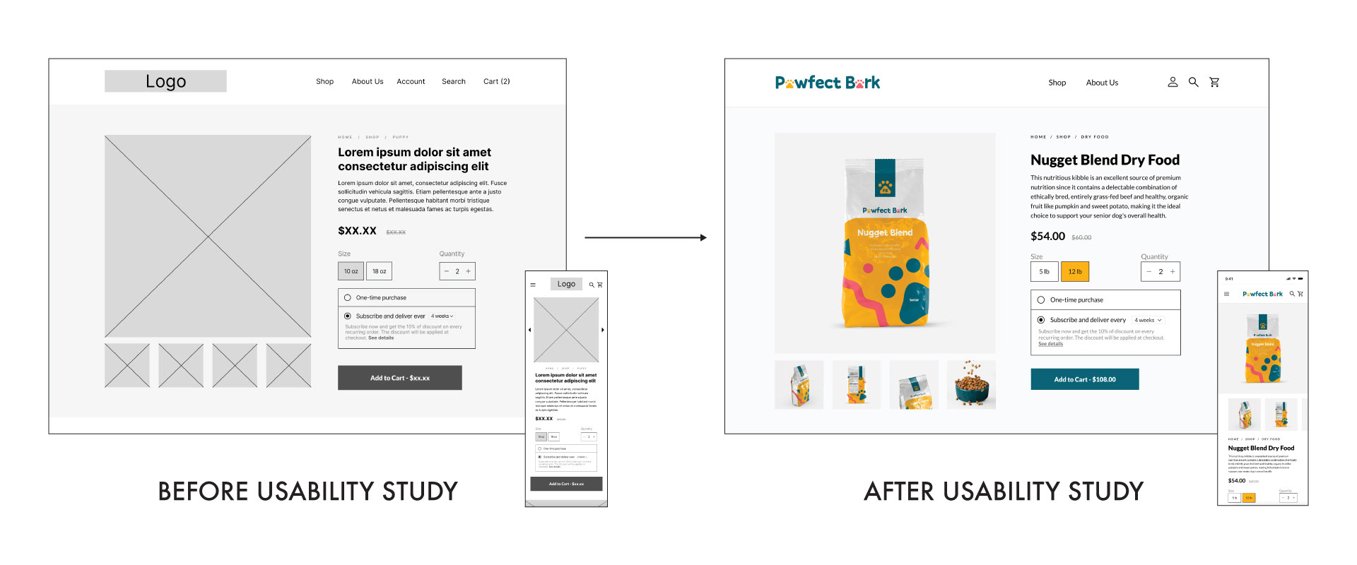
I included considerations for additional screen sizes in my mockups based on my earlier wireframes. Because users shop from a variety of devices, I felt it was important to optimize the browsing experience for a range of device sizes, such as mobile and tablet so users have the smoothest experience possible.
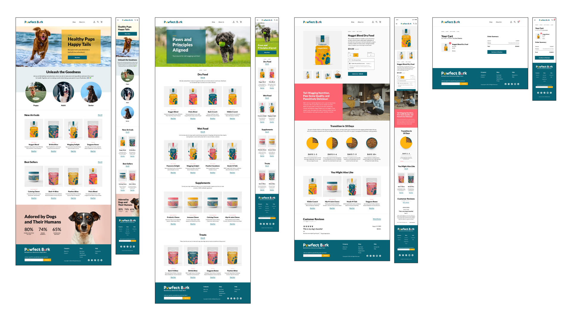
High-fidelity Prototype
My high-fidelity prototype followed the same user flow as the low-fidelity prototype, and included the design changes made after the usability study.
My high-fidelity prototype followed the same user flow as the low-fidelity prototype, and included the design changes made after the usability study.
Takeaways
Impact: Our target users shared that the design was intuitive to navigate through, more engaging with the images, and demonstrated a clear visual hierarchy.
Impact: Our target users shared that the design was intuitive to navigate through, more engaging with the images, and demonstrated a clear visual hierarchy.
What I Learned: Throughout the process I learned how to design with a desktop-first approach, how to display information in an easy-to-digest format, and how to incorporate accessibility considerations into my overall designs.